FAQ
TO PAINT IS AN ART,
TO GUIDE YOU IS OURS
General
For individuals: go to a partner shop. They can all lend you a shade card for a fixed period and on their own terms. If you want to buy it instead, the price can be found using this link. It is also available for sale in our partner shops.
For professionals (painters, architects, …): please contact us via the following email address: info@peintagone.be. The first shade card is free of charge. This also applies to our capsule collections.
For individuals: go to one of our PeintaShop Gold. They have our Peintagone unit that allows you to buy or borrow (subject to a deposit) colour cards with dimensions of 20.5 x 13 cm.
For professionals (painters, architects, ...): our colour samples (PeintaBox, PeintaFan Deck, PeintaColour Chart and PeintaCard Game) are available to order via the partner nearest you. Get in touch with them for more information on purchasing conditions. Find prices and more information about our different samples via this link.
By subscribing to our newsletter.
Find the shop closest to you via this link link. Enter your postcode and our interactive map will show the different retailers near you according to their distance. Please note that our partner shops are split into three categories: PeintaShop Gold, PeintaShop and PeintaCorner. Find out how they differ by clicking on “differentiating our point of sales”.
They are in our partner shops such as PeintaShop and PeintaShop Gold (retailers with a tinting machine allowing you to leave with the desired shade). However, some so called niche products may not be immediately available. We recommend you call your shop beforehand to ensure the availability of the desired products.
To maximise your chances of finding the desired product, opt for a PeintaShop Gold as this type of retailer offers a larger choice of products compared to our other types of shops.
Find the shop closest to you via this link link.
PeintaCorner: retailer with some of our products available immediately in white. Note that it is not possible to dye our products in these types of shops.
PeintaShop: retailer with immediate availability of some of our products in all colours.
PeintaShop Gold: retailer with immediate availability of most Peintagone products in all colours.
Regardless of the type of store, you can order all our products in all our colours in each of them.
For walls: it is possible to test our colours with our Wall Finish Semi-Matt (semi-matt aspect) in a 0.5-litre pot*.
For woods and metals: it is possible to test our colours with a wider range of aspects as most of our products in these ranges are available in 0.5 litre cans*.
Find the paints in question and their price via this link. The different packaging can be selected in the "packaging" section.
*Our testers do not exist below 0.5 litres due to shade accuracy. This packaging allows you to apply two coats of paint on a surface of +/- 3 m².
Yes! Our partners are able to tint our products in over 30,000 shades. Visit your nearest shop for more information.
For any other general queries, please visit one of our partners who will be happy to guide you.
Products - Application
Before and during application
We have set up a calculator that allows you to enter the dimensions of your surfaces to be painted and those of your surfaces to be subtracted (openings, doors, windows, cupboards, etc.). This tool helps you determine the number of square meters to paint, and the amount of paint needed for your job.
The average yield of the product is pre-filled by default and can be changed according to your estimates. Warning! The theoretical yield per layer varies according to the evenness and porosity of the substrate as well as according to the method of application.
Our calculator also allows you to enter the desired number of layers according to the type and condition of the substrate. As a general rule, it is advisable to apply one primer coat (when applicable) and two finishing coats.
Find our calculator directly on the product page you are interested in by clicking on "calculate the amount of paint required".
For rooms in which the surfaces are subjected to high brightness and that have defects (irregular capping, etc.): the more matt the aspect of the product, the better the final result will be. The matt aspect makes it possible to efficiently camouflage defects on walls and ceilings that are highly exposed to light.
For rooms that are frequently used: the more the aspect of the product is satiny, the better its resistance and washability will be.
Good to know: on your walls, we advise you to work with a semi-matt product because this aspect shows good washability in addition to ensuring a beautiful final result. On your ceilings, we recommend you work with a matt product because they are more exposed to light and require less upkeep than walls.
Products from our eco-friendly range (Finish Aqua Semi-Matt, Finish Aqua Satin, Polyprimer PU and Lak PU Gold) do not emit any particles into the air, both during and after application. They are made from eco-friendly resins and contain no solvents or plasticisers.
In addition, all our water-borne products are classified A+ regarding their emissions of volatile organic compounds (VOCs) in indoor air, which attests to the non-emission of VOCs once they are cured (after 28 days).
In a bathroom or shower room, we recommend applying our Finish Gold, Wall Finish Semi-Matt or Wall Finish Satin to walls and ceilings. These paints show excellent resistance to condensation and water vapour. Opt for our Wall Finish Semi-Matt or Wall Finish Satin in classic bath or shower rooms. For rooms equipped with a next-generation ventilation system, our Finish Gold is also suitable.
Be careful not to apply them on surfaces in continuous contact with water, in which case opt for an epoxy system or consult us beforehand.
On kitchen ceilings, we recommend applying our Finish Matt or Finish Gold.
On kitchen walls, we recommend applying our Finish Gold, Wall Finish Semi-Matt or Wall Finish Satin. These paints have excellent washability and resistance to splashes of water and grease. Opt for our Wall Finish Semi-Matt or Wall Finish Satin on walls regularly exposed to splashes of water and grease. On walls that are moderately exposed to this type of splash, our Finish Gold is also suitable.
For walls or credences behind your hob (intensely exposed to splashes of water and grease), use our Lak PU Pro Matt, Lak PU Pro Satin or Lak PU Pro Gloss to maximise resistance.
This strongly depends on the stresses to which your surfaces are subjected. We have different types of washable paints, here ranked from least to most washable: Finish Matt, Finish Aqua Semi-Matt, Finish Aqua Satin, Finish Gold, Wall Finish Semi-Matt, Wall Finish Satin.
Keep in mind:
- The darker the paint shade, the lower its resistance to wet and dry abrasion.
- The satinier the aspect of the paint, the more resistant the paint is to wet and dry abrasion.
- For surfaces that are used more frequently, opt for a semi-matt or satiny aspect.
Use our comparator to compare the products you are interested in according to their characteristics (washability, resistance, covering power, etc.).
Roughen the tiles before vigorously degreasing them using a sponge and a degreasing product diluted with water. Rinse carefully and leave to dry.
Wall tiles, their gaskets in particular, are frequently subject to intense splashes of grease or soap. Make sure you degrease them to prevent any future problem related to the paint chipping.
Make sure your sponge or cloth is clean with every use to not spread grease over your substrate! Good to know: a Solarine® solution as degreaser creates less foam than household detergent.
After carefully preparing your wall tile (see previous section), apply a coat of our Primer Extreme or Epoxy Aqua as a primer. Wait for the product to dry (see “drying time: recoatable” in the product technical data sheet) before coating it with two coats of any of our finishing paints or lacquers.
On bathroom or shower room walls in direct contact with a water supply (bath, shower, sink, etc.), we recommend applying our Epoxy Aqua as a primer and finishing coat. This two-pack paint ensures excellent resistance to cleaning agents and excellent waterproofing. However, please do not apply our Epoxy Aqua to parts of the wall that are in prolonged and repeated contact with water as this will eventually damage the paint film. For reinforced protection, we advise you to finish the painted part of the wall with a silicone seal to prevent water from penetrating the paint film.
Warning! Epoxy Aqua contains an epoxy resin that ages differently and does not have the same whiteness or aspect as an acrylic paint. Tip: Tint the product in a different colour than the walls or ceilings covered with acrylic paint.
As a rule, the drying time varies between 5 and 6 hours for water-borne paints and between 16 and 24 hours for solvent-borne paints.
You can find the exact drying time on the technical data sheet of each product as well as on their label.
It is important to seal your paint can and protect your equipment between the application of your different layers to prevent the paint from drying and therefore skins from appearing and depositing on your substrates. A paint tool with dry paint leaves traces during application.
So that your material does not dry between your layers, cover all your paint tools (brush, roller, etc.) with cling film or a plastic bag. Also remember to protect your paint tray by covering it with food wrap or a damp cloth.
After application
Here are our tips for optimal preservation of your paint:
-
If more than half of the paint is left in your can, cover the top with cling film before replacing the lid tightly. It is advisable to turn the can upside down during storage to prevent air from entering the can thanks to the barrier that the paint will form.
- If less than half of the paint is left in your can, transfer it to a smaller container that can be sealed tightly. The more the can is adapted to the quantity you have left, the longer the paint can be preserved (less air). .
- Keep your paint can in an environment protected from frost and sunlight in which the temperature is moderate.
Warning! Even if you strictly apply these tips, it is still possible for bacteria to contaminate your product resulting in a considerable reduction in shelf life (applicable only for a few days). These contaminations can occur in different ways including transmission via your paint equipment for example.
If the can has not been opened, the shelf life is at least one year in a cool, dry place, away from frost and sun.
If the can has already been opened and used, bacteria could have entered the product during application which would reduce its shelf life to a few days.
Do not dispose of your empty paint can in the wild or in household waste, instead drop it off at a waste collection and treatment centre.
Do not pour your leftover paint into pipes (sink, toilet). If you have paint that you no longer want, recycle and reuse it by offering it, exchanging it, selling it, etc. to an interested person.
However, if you need to dispose of your excess paint, ask the relevant local authorities for the regulations in force.
We always recommend painting your entire substrate in one go if you want a perfectly uniform finish.
Here are our tips if you still want to do some touch-ups:
-
Mix your can vigorously before application.
-
Use the same model of roller or brush as previously used, taking care not to load it too much so that a difference in thickness does not appear.
- Preferably use the same can of paint as previously used because two different production batches or two different packaging may have variations in shades.
- We advise not to carry out touch-ups when the period between the first coat and the touch-ups is too long because the paint applied to your substrate will not have experienced the same conditions (exposure to light, external stresses, etc.) as the paint kept in the can.
For any other questions about our products or their application, check with one of our partners who will be happy to guide you.
Colours
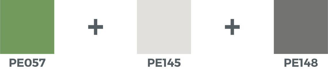
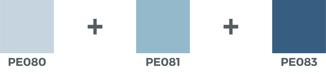
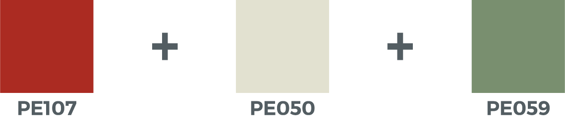
We recommend not applying more than three colours:
-
A dominant colour that covers 60 to 70% of the room, determining its general atmosphere. This colour will be used on most walls to bring out other colours and intensify the contrast.
-
A complementary colour that covers 20 to 30% of the room and connects the dominant colour to the accent colour. It will therefore be deeper than the dominant colour, but softer than the accent colour. It’s often found on furniture, doors, skirting boards, floors and/or on one or two walls.
- An accent colour that takes up between 5 and 10% of the room and adds vitality. As a result, it will be more colourful or darker than the other two. It’s often found on accessories (candles, cushions, curtains, furniture, chairs…) and/or on part of the wall (moulding, edging, cornices, window casings…).
There are 3 types of combinations:
- The “timeless” combination: associate your accent shade (see preceding point) with a neutral light shade and a neutral dark shade.
- A “tone-on-tone” shade gradient (shade palette): combine a light, an intermediary and a dark shade of the same colour group.
- The “audacious” combination: combine your accent colour (see preceding point) with a light shade and a dark shade from a same group, but opposite to the accent colour.
Warm colours

Cold colours
Two colours are called "complementary" when they are placed on the opposite side of the colour wheel:
Orange is the complementary colour of blue: it consists of a mix of yellow and red, whereas blue is not composed of any of these two colours.
Green is the complementary colour of red: it is composed of yellow and blue, but no red.
Several colours can be applied in a kitchen depending on the desired atmosphere:
-
Yellow and orange: dynamic and warm colours, ideal when preparing your delicious dishes. They bring energy, encourage creativity, promote imagination and facilitate human relationships.
-
Grey: neutral, elegant, and timeless colour that easily blends with all types of furniture and decorations. The different shades of grey allow different styles to be instilled depending on the desired atmosphere. Using a grey colour allows you to choose colourful kitchen furniture while maintaining a sober design at home.
-
Black: luxurious colour, ideal for showcasing designer furniture. It exudes an atmosphere of protection, security, elegance, modernity, and sobriety.
- White: pure, neutral, and timeless colour, ideal to bring lightness and accentuate brightness in your kitchen. It is a sure value that contributes to relaxation, serenity, and wisdom.
Several colours can be applied in a kitchen depending on the desired atmosphere:
-
Blue and green: fresh, relaxing, and soothing colours. They are conducive to concentration, reflection, and rest. They promote confidence and balance and exude an atmosphere of freedom through their natural aspect.
-
Brown and chestnut shade: cocoon, warm, and sophisticated colours, ideal for rejuvenating and promoting sleep. It is the call of the earth, of nature! They contribute to stability and serenity.
-
Pink: bright and rather feminine colour, ideal for spreading positive vibes at home. It represents love, inspires tenderness and happiness, and brings warmth to your room.
-
Red: sensual and energetic colour, ideal for bringing warmth and passion into your room.
-
Purple: intimate, warm, and sensual colour, ideal for promoting meditation and creativity. This colour is very trendy and synonymous with power and knowledge.
- White: pure and timeless colour that symbolises innocence, wisdom and peace. It contributes to the creation of a bright and relaxing space that diffuses positive waves.
Several colours can be applied in a dining room depending on the desired atmosphere:
-
Yellow and orange: dynamic and warm colours, ideal for those who love to entertain. They bring in energy, promote discussions and encourage conviviality. They transform your dining room into a cosy and welcoming space.
-
Red: energetic, warm, and cheerful colour, ideal for bringing vitality and dynamism to your dining room. It makes meals with family and friends very lively.
-
Grey: neutral and timeless colour that brings to life an elegant and soothing universe. The different shades of grey allow different styles to be instilled depending on the desired atmosphere.
-
Black: sober, elegant, and luxurious colour, ideal for showcasing designer furniture. It brings modernity to your dining room and exudes an atmosphere of protection and security.
- White: pure and timeless colour that invites discussions and relaxation thanks to the peaceful atmosphere it exudes. It makes your dining room a bright space filled with positive vibes.
Several colours can be applied in a living room depending on the desired atmosphere:
-
Yellow and orange: warm colours that go hand in hand with cheerfulness. They create a lively space conducive to imagination and invite you to be friendly, be in a good mood and share special moments with those around you.
-
Red: energetic, warm, and cheerful colour, ideal for bringing vitality and dynamism to your living room. It gives rise to passionate debates and awakens the desire and passion that lie dormant in you.
-
Brown and chestnut shade: cocoon colours, warm and sophisticated, ideal for rejuvenating and promoting relaxation. It is the call of the earth and nature that contributes to stability and serenity.
-
Grey: neutral and timeless colour that brings to life an elegant and soothing universe. The different shades of grey allow different styles to be instilled depending on the desired atmosphere.
-
Black: sober, elegant, and luxurious colour, ideal for showcasing designer furniture. It brings modernity to your living room and exudes an atmosphere of protection and security.
- White: pure, neutral, and timeless colour, ideal to bring lightness and accentuate the brightness of your living room. It invites discussions, relaxation, serenity, and wisdom thanks to the peaceful atmosphere it exudes. It is a safe bet that contributes to the creation of a bright, peaceful, and relaxing space full of positive vibes.
Several colours can be applied in a bathroom depending on the desired atmosphere:
-
Blue and green: soft and refreshing colours, ideal for manifesting a feeling of well-being in you. They are synonymous with balance, confidence, reflection and concentration. They are stimulating in the morning to start the day well and soothing in the evening to end it well.
-
White: neutral and timeless colour, ideal for bringing a Zen and classic atmosphere to life. It is a safe bet that contributes to the creation of a bright, peaceful, and relaxing space full of positive waves and serenity.
-
Grey: neutral and timeless colour that brings to life an elegant and soothing universe. The different shades of grey allow different styles to be instilled depending on the desired atmosphere.
-
Pink: bright, warm, and rather feminine colour, ideal for bringing harmony, cheerfulness, and tenderness into your bathroom. It promotes happiness and love.
- Brown and chestnut shade: cocoon colours, warm and sophisticated, ideal for rejuvenating and promoting relaxation. It is the call of the earth and nature that gives a raw and exotic side to the style of your bathroom.
Several criteria should be considered:
-
The size and height of the room; a light shade is more suitable for a small room to make it seem bigger. A large room can, for its part, handle a darker shade.
A room with a high ceiling can be made more intimate by darkening the ceiling. The dark colour will give the impression of a lowered ceiling. Conversely, applying a light colour on the ceiling will make the room seem higher. -
The brightness of the room; depending on the room’s exposure, the colour is perceived differently.
A room with few light or facing north has naturally cold lighting, so it is best to compensate with light and warm shades such as off-whites with a touch of ochre, orange, or red.
A very bright room has naturally warm lighting and will add a touch of yellow to your colours. Your choice is unlimited here:- Light colours make your room seem bigger and accentuate the feeling of a bright and spacious room.
- Dark colours add character to your space and showcase your furniture.
- Cold colours add some freshness to your room.
- Warm colours accentuate the warm effect of the room.
Gardez toutefois à l’esprit que les couleurs vives et chaudes peuvent vite devenir fatigantes sous une lumière intense. -
Be aware that vivid and warm colours can quickly become tiring under intense lighting.
-
The purpose of the room; go for deep colours in rooms of frequent use (such as hallways, doorways, walk-in closets, toilets), or of intense activities (such as gyms)!
-
The wall orientation and the light source: they can change your perception of the colour.
-
Placed facing or perpendicular to the window, the colour will absorb the rays of light and vary according to the orientation of the room and time of day.
Do you spend more time in the room in the morning? In the afternoon? Or the evening? - Applied on the same wall as the window, the colour is perceived as denser, more sombre, and more intense.
-
Placed facing or perpendicular to the window, the colour will absorb the rays of light and vary according to the orientation of the room and time of day.
On the wall that welcomes you, i.e. the first wall you see when you enter your room, the one situated opposite to the entrance. Its colour has an immediate effect on your emotions.

On the wall you directly face, i.e. the wall you are facing the most, the one you spend the most time with: from your sofa, your table, your bed, your bath...

On the wall that will beautify your indoors, i.e. the wall that, once painted, showcases the architecture or furniture of your room: a staircase, a piece of furniture, a chimney, a painting…
-
Placed facing or perpendicular to the window, the colour will absorb the rays of light and vary according to the orientation of the room and time of the day.
- Applied on the same wall as the window, the colour is perceived as denser, more sombre and more intense.
Yes! All our shades always remain available in the program of our tinting machines. Check with your nearest partner .
It is important to know that the darker the shade of a product, the faster you will see a whitish deposit when passing your hand over your substrate. In addition, a dark shade makes any defects more visible and even more so when subjected to high brightness (direct sun exposure).
In summary, we recommend you apply a dark shade on walls that are not used much, without defects and subjected to low light. For walls in rooms that are frequently used, we recommend that you to use light shades that are more resistant to repeated rubbing.
We recommend applying our Wall Finish Semi-Matt (velvety matt aspect) or Wall Finish Satin whose more satiny aspect gives even more resistance to friction.
In a room with very intense use, we recommend applying of one of our polyurethane dispersion lacquers: Lak PU Pro Matt, Lak PU Pro Satin or Lak PU Pro Gloss.
To paint over an old bright or dark colour, it is always advisable to start with the application of a primer coat (Polyprimer) and finish with the application of two coats of your finishing paint tinted in the chosen colour. An alternative to Polyprimer is our Finish Gold which can be directly applied as a primer and finishing coat. These products help to even out old colours and contribute to an optimal finish.
If you do not want to use a primer, take into account when calculating the amount of paint needed that you will need to apply more coats to cover an old bright or dark colour with a finishing paint.
For any advice on colours, check with one of our partners who will be happy to guide you.